


With the release of iOS 7 the operating system got a white and blue makeover. The same design is still present in iOS 8 and is most likely here to stay. While we like the color combination of iOS UI some users find it a little too bright. If you are one of those users then we have got a simple tip that will allow you to change the shade of blue for the buttons making them more visible and less bright. This is a nice and subtle accessibility option that takes care of the users who do not like the shade of blue used in iOS 7 and now iOS 8 and would like something darker.
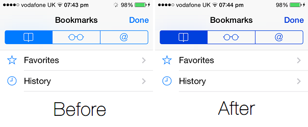
In order to change the color and increase contrast of your iOS buttons all you have to do is change a single setting. To do so head to Settings > General > Accessibility and from there tap on the ‘Increase Contrast’ option. From the next screen turn the ‘Darken Colors‘ option on. That’s it.
Another thing you can do here is turn the ‘Reduce White Point‘ button on. This will make the whitish background a little more grey and less bright. The difference between when this toggle is turned on and off is pretty evident and you will find it very useful if you find the grey shade of iOS 7 too loud.
Go ahead and give these settings a try, and let us know what you think about them in the comments below.


