


Since its first introduction Cydia hasn’t changed much in terms of design and functionality. The jailbreak store that is used and loved by millions has an outdated appearance that despite receiving several overhauls over the past few years still looks like its from 2008. Cydia fans have been releasing concepts for its redesign, begging Saurik and his team to take cues from their designs and make the necessary changes to the store. While Saurik has been responding to the criticism and to the requests by users, apparently there’s plenty more that he needs to do to make Cydia what it should be like in the modern times.
A new concept made by Reddit user, which is clearly inspired by the App Store gives us a glimpse of Cydia’s inevitable future. While Saurik’s redesign may not look anything like what is shown in the screenshots above we hope it will be at par or even better than this one.
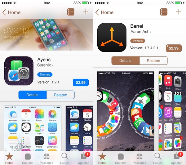
The redesign concept that is heavily inspired by the App Store shows package description pages that feature a cover photo, a purchase button, screenshot slideshow and a related button is not only beautiful but also makes perfect sense. It will not only make Cydia look modern but also make the life of jailbreak users much easier. The bottom button bar has remained the same apart from some minor tweaks, which also makes sense as there’s nothing wrong with Cydia’s current navigation bar.
What do you think about this Cydia redesign concept? Would you like Cydia to something like this? Share your thoughts about Cydia’s current design in the comment section below.


Looks nice
Cydia badly needs a overhaul! Saurik I hope you are listening…