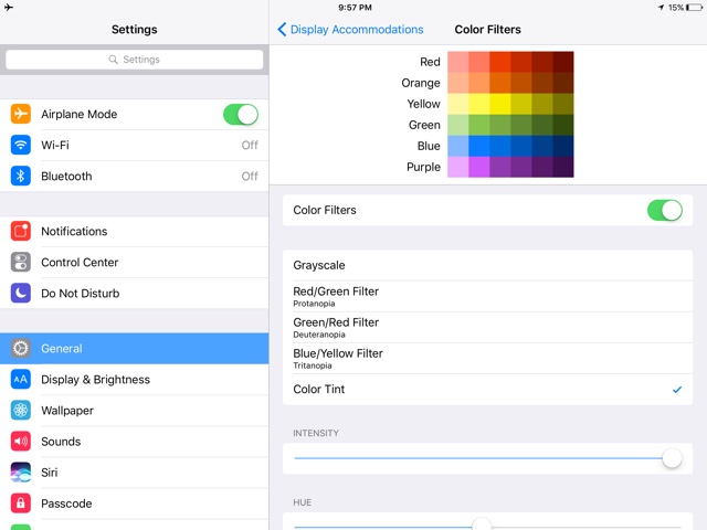
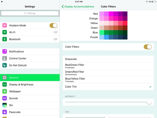
Personally, one of my favorite things about major iOS releases is the addition to small features. One of the new features introduced in iOS 10 is called “Color Filters”, and it is a great addition for making the screen easier on the eyes, as well as for the color blind. The new feature has been added in the accessibility section of iOS, and while it is targeted towards those who are color blind or those who find it difficult to read text others can try it just for aesthetic reasons.
On iOS 10 going to General > Accessibility > Display Accommodations > Color Filters, you will now be presented with a list of options. The Grayscale option has now been moved here, but the best part is the options that allow you to swap colors. This could be great for the color blind, who perhaps don’t see colors as they are. Below these options is a “Color Tint”. It’s kind of similar to Night Shift, but instead of the color being orange, you can select the color hue as well as the intensity. This is great to your iOS device a nice cool blue, or a warm red.
The Color Filters feature of iOS 10 is found on both iPhone and iPad. How do you like this new feature? Are you color blind? Let us know how you benefit from this feature in the comments below!


Colorblind here (deuteranope) and this setting interests me. By enabling it at max setting I’m able to pass colorblind “dish” tests. Android included a similar setting in Android L and it appears drastically different on screen – trying to research the methodology behind each.
I am not color blind, but I love this feature. If I need to text someone from a dark place – ie movie theater. Going Tint – Hue – Red and dimming all the way to minimum make the screen completely invisible to anyone else around. I call it ‘submarine’ mode for dark/night use.