One of the rumors that many sources have confirmed is the fact that Apple’s 10th Anniversary iPhone, the iPhone 8, iPhone Edition, or whatever else you want to call it, will feature a “Function Area” at the bottom of the screen. You can think of it as a Touch Bar on the latest MacBook Pros. With the announcement and developer release of iOS 11, we can see that Apple might have given us a glimpse of how this upcoming Function Area will work.
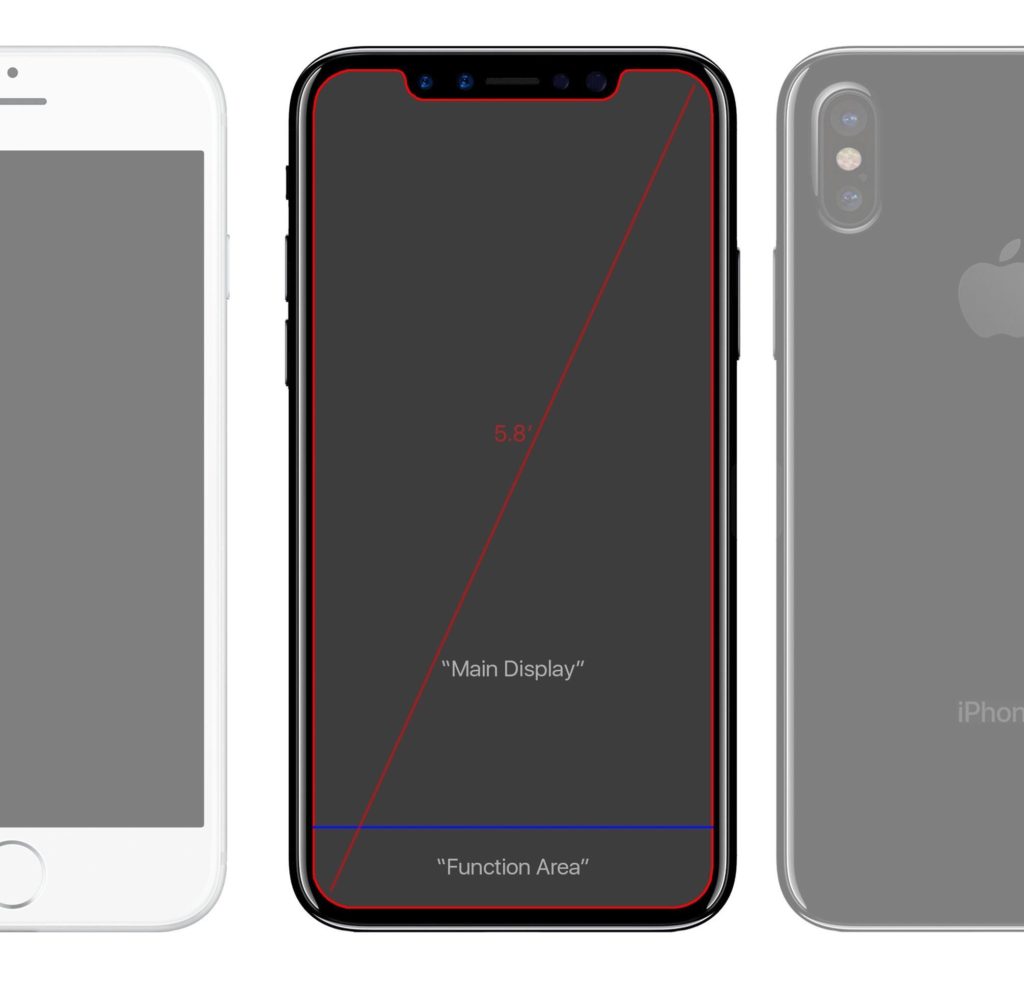
According to Benjamin Geskin, a small area at the bottom of the screen will contain the Function Area. You can see his picture below.
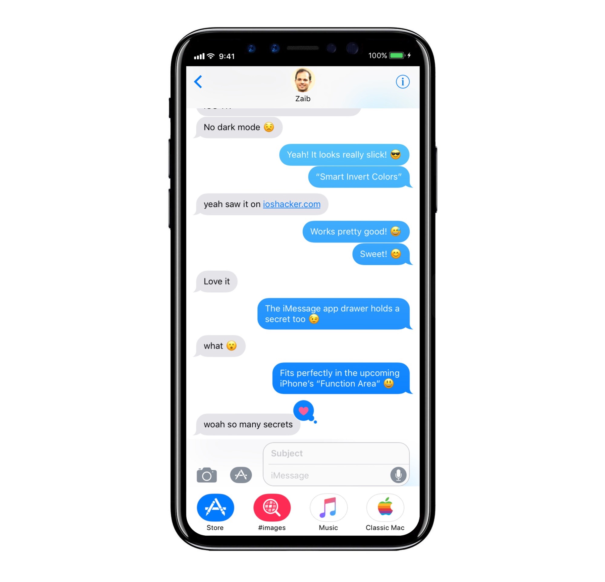
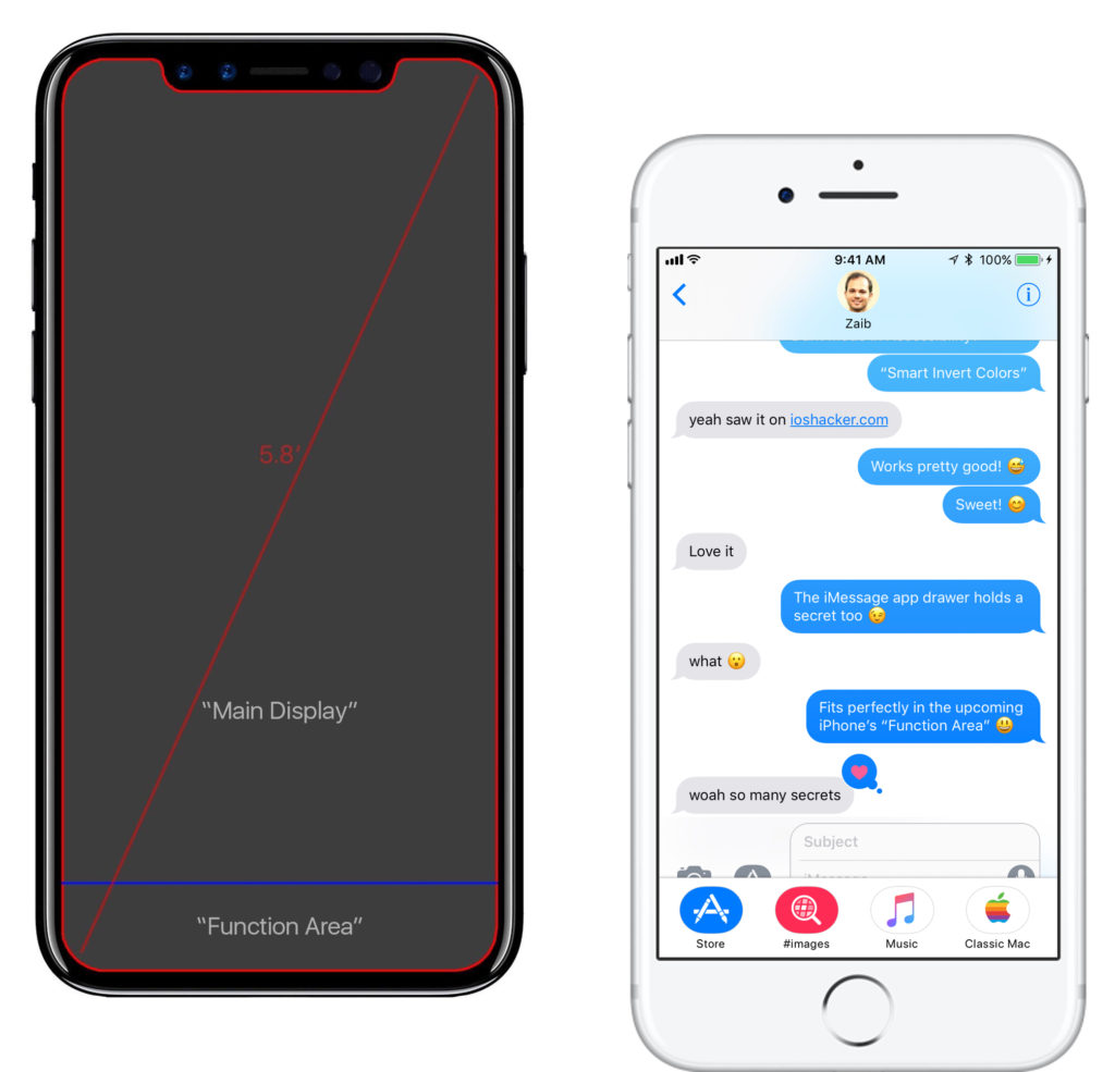
With iOS 11, one of the new features that Apple introduced was an App Drawer for iMessage apps. When you magnify the App Drawer, something interesting happens. The size of the expanded App Drawer is exactly the same size as the function area according to Benjamin Geskin’s leak.
We can learn a couple of things from this. For one, we have a pretty good idea regarding the size of the Function Area. You can open up iMessage on a device running iOS 11 and fiddle around with the App Drawer to get a feel of how the Function Area would work. Second, we can see that, most likely, the Function Area would dynamically change according to what app you are in and what you are doing. Since it is rumoured that the iPhone 8 will feature 5.15″ of usable screen space, some people were disappointed that this would make the screen practically half an inch smaller than the iPhone 7 Plus screen size of 5.5″.
But if Apple makes the operating system and apps use the Function Bar in a similar way to how we see it work with the App Drawer, there won’t be a noticeable difference. In fact, it can feel more crammed on the iPhone 7 Plus, as the App Drawer overlaps some other UI elements when enlarged. To keep it from being non-intrusive, it has to be minimized. It seems like the iPhone 8 will hit the perfect balance of having screen real-estate and using the screen to the best of its potential.
What do you think of this year’s upcoming iPhone? Do you like the idea of a Function Bar? What do you think of the new iMessage App Drawer in iOS 11? Let us hear your thoughts in the comments section down below! And be sure to follow us on social media for more updates regarding Apple’s next iPhone and iOS 11!
Special thanks to Benjamin Geskin for providing some of these mockups!


