The original Tweetbot app for Twitter debuted on iOS three years ago. Ever since its release this app has been the favorite Twitter client for an overwhelming number of iOS users due to its unique design and features that made it better than Twitter’s own offering or any other third party apps available in the App Store. Now with the release of iOS 7 there was a need of redesigning the app from ground app to match the new interface of the operating system, which takes the app further from where it has been standing since 2011.
After one and a half month since the release of iOS 7.0 Tapbots delivered the update everyone has been waiting for and it is now available for download at an introductory price of $2.99. The new app has been released as a separate entity in the App Store and only supports devices running iOS 7.0 or above. Despite the excitement initial response from the users who were already using previous versions of the app wasn’t ideal as they took it to Twitter to complain about Tapbots’ decision of releasing the iOS 7 version of the app separately. Now users who have owned Tweetbot previously have to buy the Tweetbot 3 in order to use the latest version. Tapbot maintains that the app is completely redesigned and they are offering the new app at a discounted price so their old customers can take advantage of the offer and pay less to get the app.
While both point of views have their own merits the Tapbots is right in saying that the Tweetbot 3 has been redesigned from ground app and it deserves the minor payment of $2.99 company is asking. On top of that the new version is much better than the older one in terms of looks, performance, features and usability making it a worthy investment.
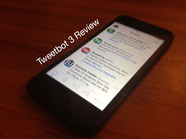
If you have used the previous versions of Tweetbot then Tweetbot 3 would seem like a completely different app. The iOS 7 inspired interface that has many similarities with the Twitterrific app will make it look like a new world. The white background, circled profile pictures, less noisy top bar and subtle navigation bar makes the whole experience minimalistic. This of course is a huge difference then the older flashy and robot-inspired interface.
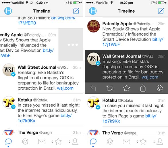
Timeline is the heart of Twitter experience and Tweetbot has utilised the potential well. The new timeline has the same features as the previous version of the app but has its unique features as well that make it a refreshing change. The profile pictures are now rounded instead of being squarish with iPhone icon like edges. The background features a new look as well and has fewer lines and colors. In fact there are no colors in the background at all giving it a clean white look like most parts of iOS 7. The text looks much larger than before, which makes you wish there was an option to make it smaller – something you can do in Twitterrific app, which by the way also lets users to choose between a black or white themes.
Tweetbot 3 has a new mode for timeline that can be accessed from the second button located on the right side of search bar. The second mode allows users to only see large images that have been shared by users they are following on Twitter. The photo mode is very much similar to the Instagram news feed displaying large pictures for the user. One very useful and innovative feature that I am particularly impressed of in Tweetbot 3 app is how it shows the number of new tweets that have arrived after every refresh. The numbers appear on top right side of the timeline, right below the compose button that makes it easier to see without it blocking view for anything or taking away the real estate. The good thing is that the timeline keeps on updating itself without the need pulling to refresh again and again and so does the tweet number indicator.
Unsurprisingly the Tweetbot 3 app for iPhone and iPod touch has gestures and shortcuts – a lot of them. This makes navigating and performing different tasks a lot more convenient. Some of the useful gestures and shortcuts include:
- Slide a tweet towards left to reveal a detailed tweet page with conversations, time and date, information about faves or retweets and tweet actions.
- Single tap on a tweet to reveal tweet actions including reply, retweet, fave, coping or emailing options and settings.
- Pull to refresh the timeline – of course.
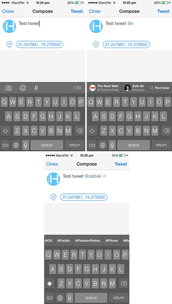
Depending on how often you tweet the compose screen is the second most important feature of a Twitter client. Just like every other part this one has also been redesigned from ground up and is very different from the previous version of the app. The compose screen of Tweetbot 3 for iPhone is as simple as it could get. User is presented with a simple compose area with his or her profile picture. At the bottom of the profile picture is the location button which allows users to either enable or disable the location sharing feature. Right above the keyboard is the bar that has the three useful buttons including the camera button that lets users share their photo with a tweet, the ‘@’ button to mention someone and the ‘#’ button to add hashtags to the tweets. The most favorite feature of the compose screen for me is when you start typing and add a ‘@’ or ‘#’ symbol to your tweet the bar changes into a suggestion area and starts displaying either the usernames or the matching hashtags based on the entered letters. This makes tagging people into tweets or adding popular hashtags much more intuitive.
Have more than one twitter accounts? Then you will like Tweetbot 3’s new account switching feature. To switch between one account to another all you have to do is tap on the account’s display picture from the top bar and then from the list select the account. You can add more accounts to Tweetbot using this very screen and also access app’s settings by tapping on the round shaped icon with a nut glyph on it.
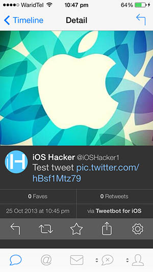
The tweet detail page that can be accessed by swiping towards left side offers detailed information about any particular tweet. This includes any replies associated with this tweet, number of retweets and favorites it has acquired, the time and date it was sent as well as the platform or client that was used to send it. If any tweet has an image attached the detail page shows it on the top followed by the tweet’s text and other options. This looks pretty cool when someone has shared a good looking picture. The tweet detail page of Tweetbot 3 also has the buttons for different tweet related actions.
One of the features that I am very much fond of is the Mute Filters feature of Tweetbot. This feature lives in the Tweetbot 3 as well allowing users to mute people, keywords, hashtags and clients from their timeline and lists. This feature is particularly useful when you don’t want to get tweets about some event, topic or something that’s happening that don’t concern you or you find annoying. This feature can be accessed by performing tap and hold on the fourth button of the navigation bar.
Tweetbot cannot be complete without its fun and sometimes annoying sounds. Tweetbot 3 for iPhone also features dedicated sounds for when a tweet is sent, you receive a notification, when you pull to refresh and when the app cannot detect a working internet connection to fetch new tweets at which point it will also show the big red warning notification. Sounds on this version are different from the older one. Now they seem more natural and pleasing, which is a welcome change from older ones that were more mechanic in nature.
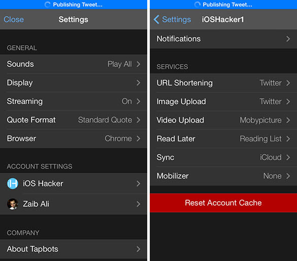
The Tweetbot 3 settings that can be accessed from ‘Select an Account’ screen provide different options to change aspects of the app. This includes options for sounds, display, streaming, quote format and browser selection. Tweetbot 3 gives the ability to users to decide whether they want their links to open in mobile Safari or Google’ Chrome for iOS. The same menu also offers an option to open files within the built-in menu of Tweetbot or in an outside browser. There are account specific settings as well which can be accessed by tapping on the individual accounts.
Users have the ability to configure notifications for each account, select URL shorteners, image upload service, video upload service, select read later service for accounts and more.
Tweetbot 3 is only available for iPhone and iPod touch right now and iPad version will be released soon as well. Needless to say that the iPad edition of the app will be available separately and you will have to purchase it.
Concluding the review I would say that Tweetbot 3 is a must have app for someone who has been using the previous version of the app as well as someone who is looking for a good Twitter client for iOS. Its simple yet useful design, clean look and features have helped in making a great Twitter client even better. Moving forward the Tweetbot 3 app is going to get even more features as Tapbots has already announced that the night theme, additional gestures, option to resize text and more will be added in the coming updates.
You can download Tweetbot for your iPhone or iPod touch running iOS 7 here. The app is available for $2.99 for a limited time. Hurry up before it gets back to the original price of $4.99.
Pros
- Nice UI, animations, sounds and a refreshing look
- Great shortcuts and gestures
- Simple and easy to use interface
- Multiple account support/easy switching
- Large image previews
- Mute filters
Cons
- Several key features missing from first release including text resizing and dark theme
- Some people might find it hard to accept that they have to pay for it again


