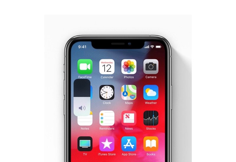
iPhone’s Volume HUD has long been criticized due to its ugly and obstructing design. With iOS 13 Apple has finally redesigned the Volume HUD and made it more modern and significantly less obtrusive than before. As the new Volume HUD is found in iOS 13 beta, it will be making its way to all iPhones and iPads later this year when iOS 13 is released publicly.
The new iOS volume HUD appears on the left side of the screen and looks quite similar to the volume and brightness sliders that you get on the Control Center. When users press the volume button the volume HUD appears on the screen in its full size, and then automatically minimizes itself towards the side of the screen. The volume HUD remains minimized as you change the volume while showing the current volume level.
Unlike the older volume HUD, the new iOS 13 volume HUD also allows users to interact with it. Users can tap on the HUD and move the slider up or down to change the volume with their finger. This adds to the convenience for the users, as they no longer have to keep pressing the buttons to reach their desired volume level.
You can watch the Volume HUD in action below.
The iOS 13 non-obtrusive volume indicator is much better pic.twitter.com/a05GN0l4f9
— Phil (@trollied) June 3, 2019


