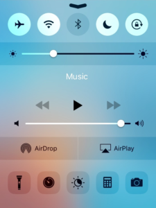
I have seen several different opinions on iOS 10 since it’s launch. One of the things that I’ve seen being discussed often is the new Control Center. Some people love the new design, while others hate think it’s a waste of space. Personally, I like it, but I think it could care for some updates. For example, it would be nice if the “Home” card was on the left side, with the main Control Center tile being in the middle. Not only would this make it easier to access, but then the toggles and other commonly used functions would be centered. I also would like it if the card were stacked on top of each other on the iPad, to eliminate swiping and take advantage of the larger screen.
With all this discussion on the new Control Center, we thought we would ask our readers what they thought about it. Let us know your thought of it in the poll down below:
And while we’re at it, tell us any other additional thoughts you have of iOS 10 down in the comments section below. We’d love to hear for you!


