We have all been waiting for a macOS redesign that will bring the desktop OS closer to iOS. Based on the recent rumors that claim Apple is working on allowing app users to design and run their apps on both macOS and iOS platforms for this year’s update, we are hopeful we will see major changes to macOS sooner than later.
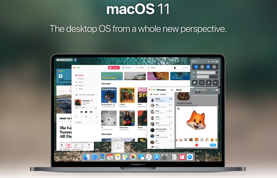
Designer Álvaro Pabesio has taken his wishes a step further by turning his thoughts into a concept that we can all see and enjoy. The macOS 11 concept that is heavily inspired by iOS 11’s UI elements brings things like Control Center, proactive Siri, notification center, dark mode and design syncing.
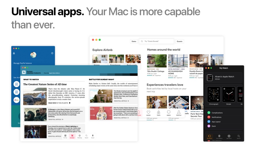
Perhaps more importantly, it shows how iOS apps will look like when running on a Mac. In the concept we can see iOS apps including News, Paypal, Watch and Airbnb running on Mac. The apps as shown in the concept look exactly like they do on an iPhone or iPad, except there are close, minimize and fullscreen buttons on the top left.
The addition of Control Center is also interesting, as it could integrate features like settings toggles, brightness controls, volume slider and utility shortcuts that would eliminate the need of having these options in the menu bar, which can then be made more minimalistic. The concept also adds an iOS 11 like screen recording feature that is currently dependent on QuickTime on the Mac.
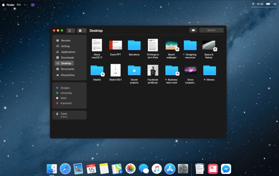
Other macOS apps and elements like Finder, Notification Center, Settings, iTunes, Sidebar, Messages, FaceTime, App Store and others have also been heavily redesigned to give them a modern look. You can view the macOS 11 concept in its full glory here.


