Personally I am not a huge fan of Samsung S9’s design. Even though it does not have an iPhone X like ‘notch’, it does have two bars on top and the bottom. This creates an awkward looking device and wasted space that could have been utilized for something useful or for at least adding more real estate to the screen.
Unlike many Android manufacturers Samsung refrained from copying the iPhone X’s notch design and instead opted for adding the ugly black on top and bottom. This lead many to wonder what if Samsung had copied iPhone X and added a similar looking notch to its device.
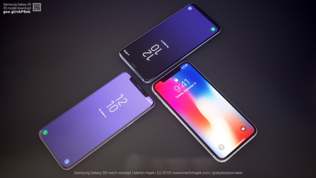
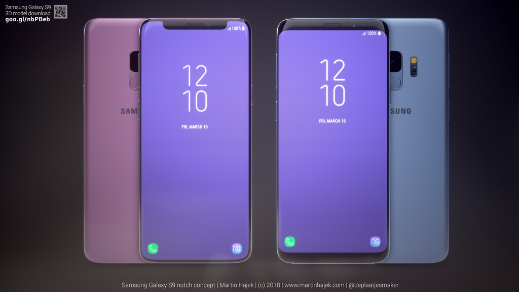
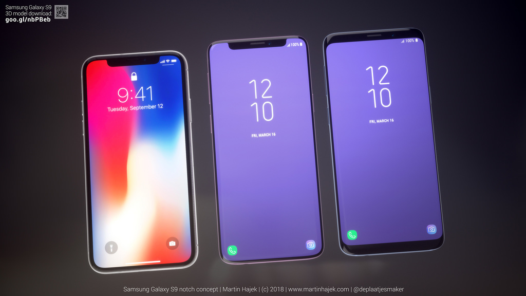
Thankfully though we no longer have to wonder as designer Martin Hajek has posted concept mockups showcasing Samsung S9 with an iPhone X inspired screen design. The result actually looks good and better than S9’s current design.
Hajek has also compared the original Samsung S9’s design with his concept design and the result is quite predictable. The Samsung Galaxy S9 notch concept actually looks better than the actual S9 and offers more usable area and less imposing black bar on the top. The bottom bar is non-existent on the concept, giving more usable screen area to the user.
You can view more concept images on Hajek’s website here. What do you think about this concept? Share your thoughts in the comments section below.


