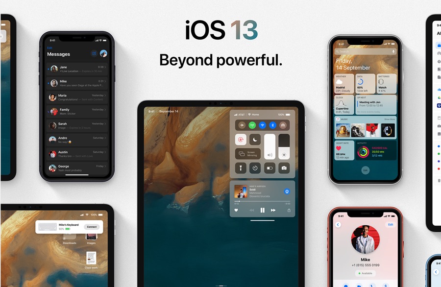
We are less than 2 weeks away from official iOS 13 announcement at WWDC 2019. Ahead of the event we have seen many reports from credible sources revealing what new features can be expected from this major iOS release. Now designer Álvaro Pabesio has visualized the rumored iOS 13 features into impressive looking concepts.
Unlike many concepts that we have seen in the past, this particular iOS 13 concept appears to give us the most realistic look at what we can expect iOS 13 to bring to iPhone and iPad.
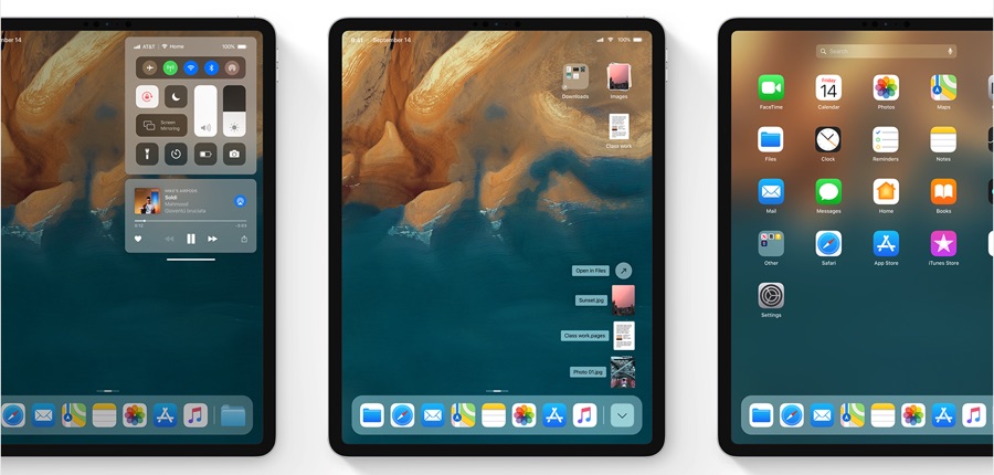
For starters the concept by Pabesio imagines Mac like features for the iPad, including the ability for users to have multiple users accounts and switch between them from the lockscreen. He has also imagined a redesigned Bluetooth connectivity experience for iOS devices, where Bluetooth devices appear on the screen as a notification banner, allowing user to quickly connect to the device by tapping on the connect button.
In the concept iPad has received special love and has gained many new features that appear to have been taken from the Mac. This includes the Stacks feature, a downloads folder in the dock and a home screen that looks a lot like the macOS Launchpad.
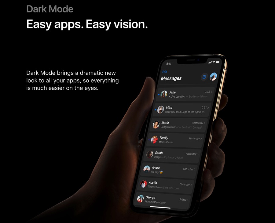
No iOS 13 concept would be complete without the mention of dark mode, and this concept does not disappoint. In the concept the designer has imagined a dark mode that expands to all parts of the iOS system including stock and third-party applications.
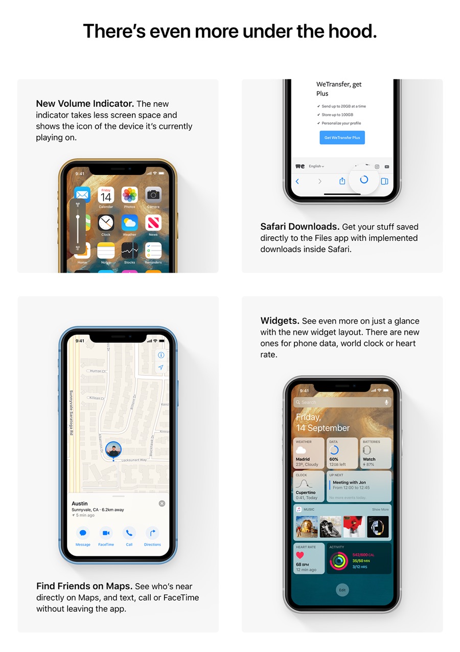
While big changes are the most exciting, every major iOS release also brings many small changes to iOS devices, and iOS 13 is going to be no different. The concept imagines many under the hood changes in iOS 13 including a minimalistic volume HUD, a Safari Downloads tab that allows users to directly download files to the Files app.
The expected merger of Find My iPhone and Find My Friends services into a single app has also been mentioned in the concept with ability for users to locate their friends on the Maps.
One feature that I really hope makes it to actual iOS 13 is the Redesigned Widgets screen showcased in the image above. With the redesigned widgets users can have an at a glance look at useful information from different applications, similar to the Infograph watch face on the Apple Watch Series 4.
You can see the full iOS 13 concept by Álvaro Pabesio on Behance here.
4 iOS 13 Concept Wallpapers Until We Wait For The Official Ones


