Yesterday, we revealed that the iOS Apple Store app had a hidden dark mode. It could be revealed by enabling the Invert Colors option, and it worked by having the UI colors inverted but not pictures. Now that we have our hands on iOS 11, we can see that Apple has improved on the Accessibility option and brought this to even more places in iOS even though it didn’t bring a full-fledge dark mode as everyone had hoped.
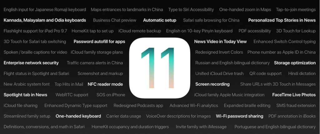
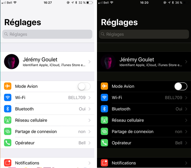
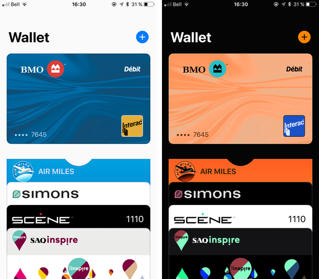
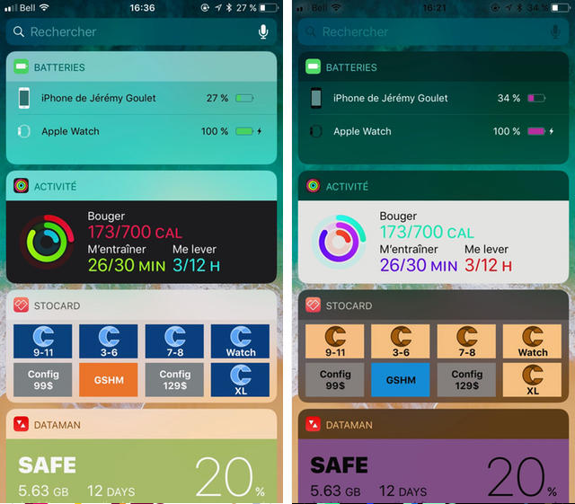
Hidden away on a slide during the keynote presentation was feature called “Redesigned Invert Colors.” Just like in the Apple Store app, it works by inverting the image colors when enabled (so when you inverted the inverted images, it appears normal.). Below are some comparison photos with the ones on the left being with Invert Colors off and the ones on the right with Invert Colors on.
Unfortunately, it appears that there is still work to be done. For example, some widgets do not support this function, and some apps, like Wallet, don’t work altogether.
Still, I am very happy to see this new feature. I have been wanting a dark mode in iOS for many years. While invert colors was okay, it never was a true Dark Mode because of the inverted images. Now in iOS 11, I’ll be using this feature a lot more. The only downside is that this feature is tucked away, so many people might not get use out of it.
To enabled this improved Invert Colors option, open up the Settings app and go to General > Accessibility > Display Accommodations > Invert Colors. Please note that the improved Invert Colors feature is only available in iOS 11. While you can invert colors in older versions of iOS, it won’t be as smart, as it will invert the entire display (unless you use it in the iOS App Store, as already noted)
What do you think of this new and improved Invert Colors option? Will you be using it more? Let us know your thoughts in the comments section down below!


