Every year, Apple updates it’s operating systems at the World Wide Developers Conference, and this year is not going to be any different. Such updates include security and performance updates, visual changes, and new features. WatchOS 3 brought several features such as a Dock for quick access to frequently used apps, three new watch faces, support for wheelchair users, and new Breathe, Reminders, and Find My Friends apps. As we wait for Apple to announce watchOS 4 at WWDC on June 4, we thought we would make a list of some of the features we’d like to see from the next generation of watchOS.
Third-Party Watch Faces
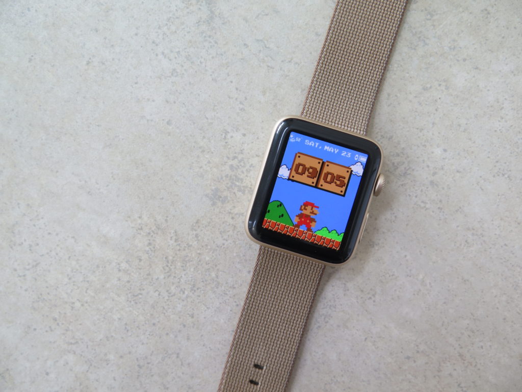
This is the biggest feature that we’d like to see from Apple’s watchOS 4. While Apple has done a very good job of providing many watch faces and customization options, both with hardware and software, there is only so much the company can do to make it truly personal. The next logical step would be to open up watch faces to developers. Doing this would open up an entire world of possibilities. It would allow developers to create new, innovative watch faces, some of which perhaps Apple never thought of.
It would allow users to have access to hundreds of different watch faces, with new ones coming out every day since it would not need to be dependent on Apple releasing a few new ones every year. A user could find a perfect watch face for their specific needs that just simply isn’t offered in Apple’s stock watch faces. And having a Watch Face API would enable watch faces with licensed characters and themes. It would be possible to have a Super Mario or Star Trek watch face for example.
The downside of opening up watch faces to developers? First is that, most likely, some of them will be paid items. While I have no problem paying for quality built software, I do know many that aren’t as thrilled to offer money on software, especially on things such as stickers and keyboards. Much like that of the Stickers found in the iMessage store, developers could charge for certain watch faces, making you watch your wallet before you splurge into a whole bunch of watch faces. However, again, like the Stickers in the App Store, a watch face could be bundled with apps, so if you buy a certain app, you can have an accompanying watch face to go along with that purchase for free. Another thing Apple will need to ensure is the quality of watch faces.
No doubt it will have guidelines for developers to follow to make sure that high-quality watch faces won’t get drowned out by a bunch of quickly rushed watch faces.
Since Android Wear’s public debut in December 2014, it has had an official watch face API for developers to create and share creative, fun, and beautiful watch faces. Since Apple markets the Apple Watch as a very personal device, it seems like the most likely feature we’ll see in watchOS 4 is third-party watch faces.
Improved Nightstand Mode
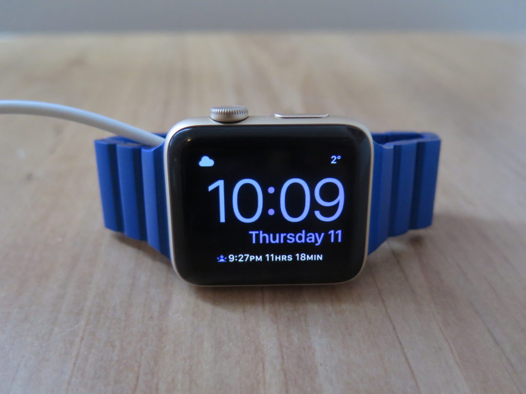
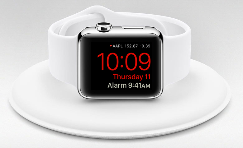
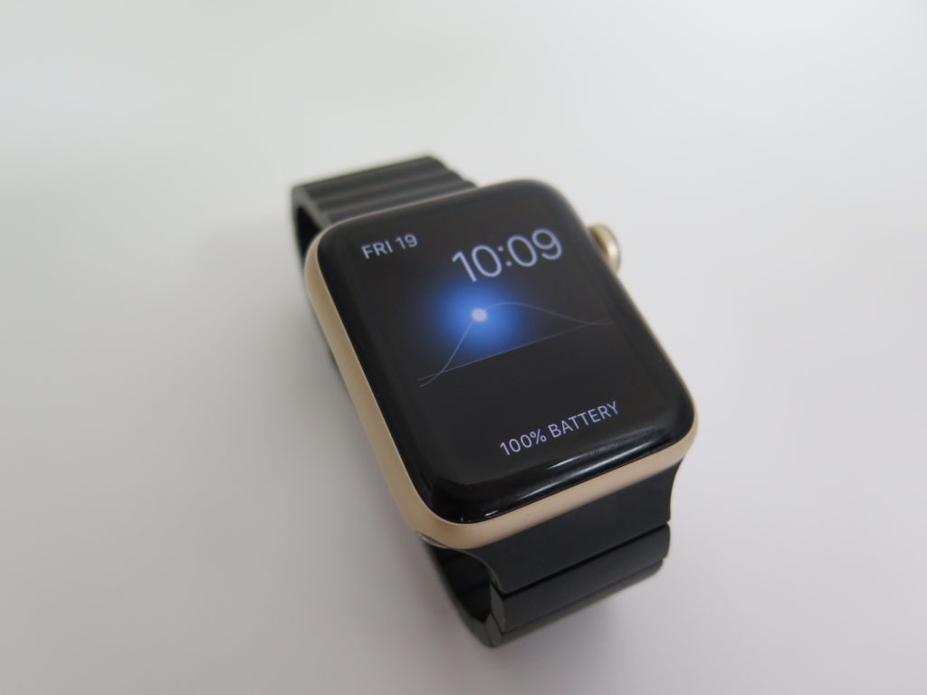
Nightstand mode was a great addition to the Apple Watch when it was first introduced in watchOS 2. It allowed the Apple Watch to still tell the time even after it was off your wrist, and it made clever use of the digital crown as a snooze button, and the side button to turn off the alarm. However, besides the time that you want the alarm to go off, Nightstand mode is not customizable by any means. What we’d like to see in watchOS 4 is some customization options for Nightstand mode. First and foremost, the color. Instead of the standard green, it’d be great if the user could select from a variety of colors, much like that from Apple’s standard watch faces.
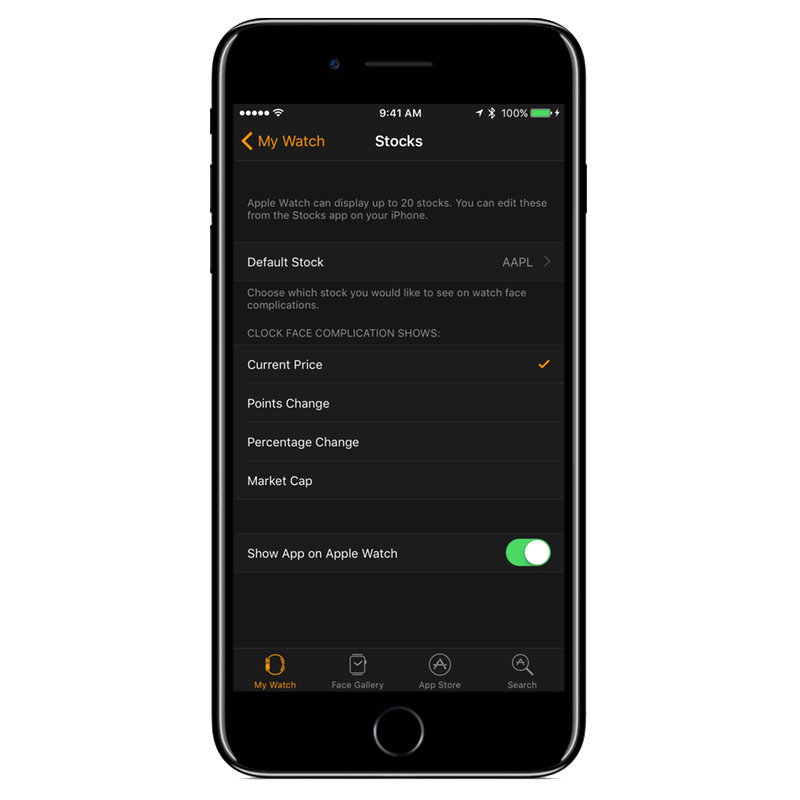
Another thing we want to see added to Nightstand mode is Complications. Complications are great on watch faces, giving you quick and clear information at a glance, without having to open an app. We think having information at a glance with Complications would be great in Nightstand mode too. It could display information such as the weather for tomorrow, the time of the sunrise, your first calendar event for the next day, stocks, etc. While we’re at it, having “Hey Siri” enabled while in Nightstand mode would be helpful too. Then you could just say “Hey Siri, Goodnight,” and your HomeKit enabled smart lights could turn off.
Hide Apple Apps
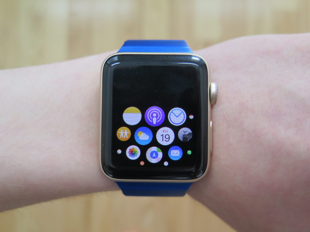
The home screen on the Apple Watch is a bit of a mess. It has a bubbly honeycomb style design, and while it looks nice, it can be pretty hard to navigate, especially when you got loads of apps. You can remove third party apps that you don’t use to clean it up a bit, but having the ability to remove Apple apps that you don’t use would be a great help.
Apple includes over a dozen apps built in, and while some I use quite frequently, others I never touch, such as Find My Friends, Maps, Mail, and Stocks. Being able to remove these would help clean up the home screen and make it fairly usable, making it better to find the app you want.
More Apple Apps
I know, I know. My last request was the ability to remove Apple apps. It seems kind of odd that right after requesting that, I would want more apps made by Apple on my watch, but to be fair, I would want the ability to remove Apple apps before Apple decides to add more. That being said, I’d love to have a notes app on my Apple Watch. Having a shopping list on your wrist would be handy, eliminating the need to have your phone pulled out. It would also be nice to create a new note with Siri on the watch without needing to continue the process on your iPhone.
Another app I have seen many people request is a native podcast app on the Apple Watch. While I don’t listen to podcasts very much, I do see the appeal of having it, and I’m sure the podcasts app would be a welcome addition to many users in watchOS 4.
New & Improved Apple Watch Faces
While I still expect third-party watch faces to be the main headline of watchOS 4, I still hope Apple takes some time to create some new watch faces, as well as improve upon some older watch faces. Since it’s most likely that many third party watch faces will be paid, it’d be nice for Apple to include some new free ones. While Apple is refreshing their watch face lineup, I wouldn’t mind them improving a few others too. I’d love the ability to display seconds on the modular and photo watch faces, as well as in the clock complication. I’d also like to have the ability to have complications on both the Astronomy and Solar watch faces.
Change The Swipe To Switch Watch Faces Action
In watchOS 3, Apple added the ability to quickly switch between watch faces simply by swiping from one side of the screen to the other. While it sounds helpful, in practice it’s a lot less useful. While swiping between faces, you have to wait for the face to fully load before you can swipe to the next one. This wastes a good amount of time when you are quickly swiping through a lot of watch faces, and quite frankly, it isn’t that hard to force touch on the screen to select your watch face. It can be even faster in some cases.
So, what could Apple do with this? The first thing that comes to mind is having quick access to apps. You could select two apps of your choice, and then you could access one by swiping from the right to the left and access the other app by swiping in the opposite direction. This would be a great way to access apps very quickly and could help with some setups. For example, if someone is going for a minimalist look, having two buttons on the watch face linking to apps would probably not be ideal. With the ability to swipe to certain apps, a user could maintain a simple watch face look and still have easy access to their favorite apps.
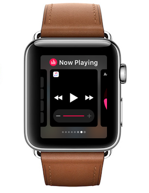
This would also be a good solution to the “Now Playing” app in watchOS 4, which in watchOS 3 is only available via the dock, compared to a quick swipe up on the watch face to invoke glances in previous versions of watchOS.
Perhaps Apple could also add some other actions to swiping on the watch faces. For example, a swipe from the right to the left could skip the current song you are listening to, and a swipe from the left to the right could go back to the previous song. A menu option in the iOS Watch app could let you select whether you want access to apps, quick song controls, or the ability to switch between watch faces if that’s what you still want.
Improved Siri
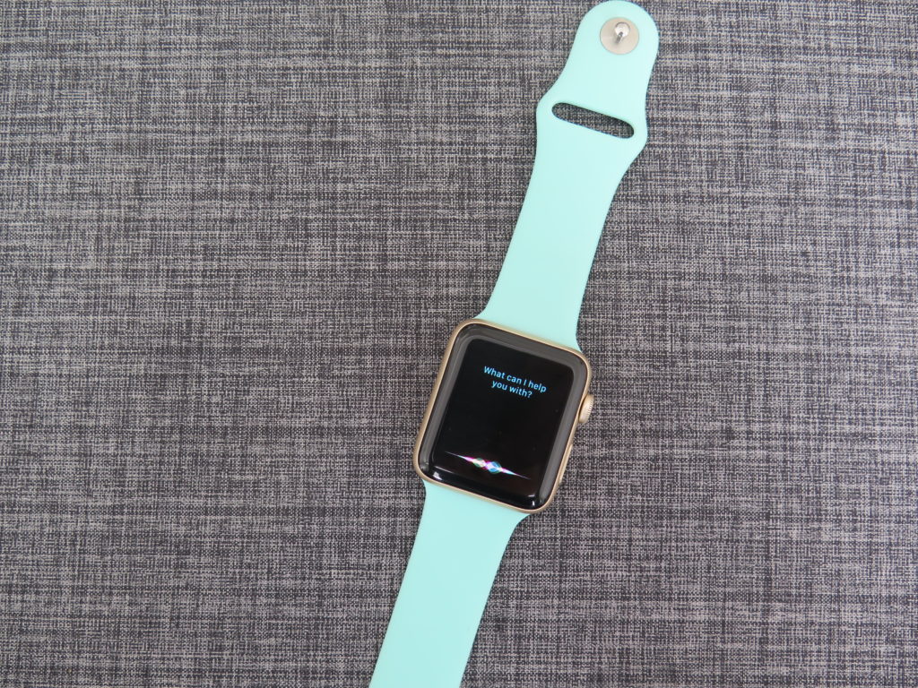
Because of its small display, voice control via Siri is a popular way to interact with the Apple Watch. That being said, the experience with Siri could use an update. It’s rather slow compared to Siri on the iPhone, especially on older models of the Apple Watch, and it lacks vocal responses.
Voice feedback from Siri seems like a no brainer in watchOS 4. For some users, the text can be hard to read on the Apple Watch’s tiny display. Having voice feedback would be great for them, as well as for cases when you’re not looking at the display. Just like on the iPhone, we’d like to see some options regarding voice feedback. It could always be on, controllable via Silent Mode, only when activated via “Hey Siri,” or no voice feedback at all.
Another little annoyance with Siri on the Apple Watch is the color waves at the bottom. On the iPhone, they react to your voice, giving you a visual indication that you are being heard correctly. On the watch, it just moves slowly. It doesn’t respond to your voice. Changing it to react like on the iPhone would be a nice little touch in watchOS 4. And of course, we would be more than happy if Siri received some speed improvements.
There’s our wish list for what we want to see from next version of watchOS! Thankfully, we won’t have to wait much longer to see what Apple has in store for watchOS 4, as it should be announced at the WWDC’s Keynote event on June 5, 2017.
Do you agree with our list? What do you want to see from the next iteration of watchOS? Let us know all your thoughts in the comments down below! As be sure to follow us on social media, as we’ll post updates regarding the announcements of watchOS 4, as well as iOS 11, macOS 10.13, tvOS 11, and anything else that will be announced at this year’s WWDC!




Yes. Also allowing a native Spotify app! But my number one issue with my watch right now is getting rid of the swipe up to reveal music controls. I used to control podcasts and music while driving using this action! Now, I wait until a stop light to dig up my phone and use the lock screen controls because the dock is too cumbersome, too many actions, and takes forever to load. C’mon, Apple! You ruined a good thing.