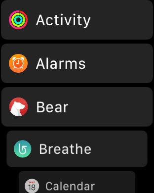
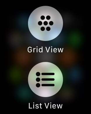
Starting with watchOS 4 Apple has added a new brand new way to view and interact with the Apple Watch homescreen. Since the original Apple Watch, watchOS has had a homescreen that displays all the circular app icons at one place, in a grid view. While it looks good, many users find it hard to locate their apps.
If you are running watchOS 4 or later on your Apple Watch, then you can now switch to the list view, which displays all the apps in a scrolling list. The best thing about the list view is that it arranges the apps in alphabetical order, which really makes it easier to find the app you are looking for.
You can switch to the list view by simply force tapping on the home screen and then choosing the ‘List View’ option. Once you do all your app icons will appear in a list. You can then scroll up or down with your finger or through by rotating the digital crown button. To switch back to the grid view just force tap again and then tap on the ‘Grid View’ option.


