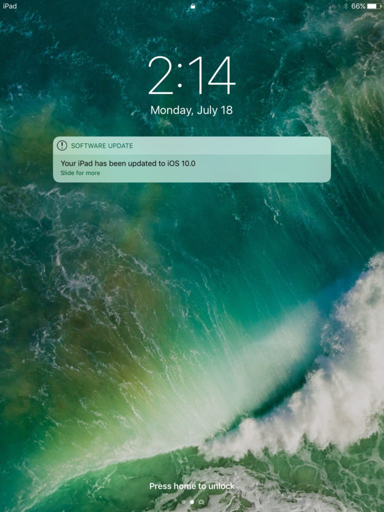
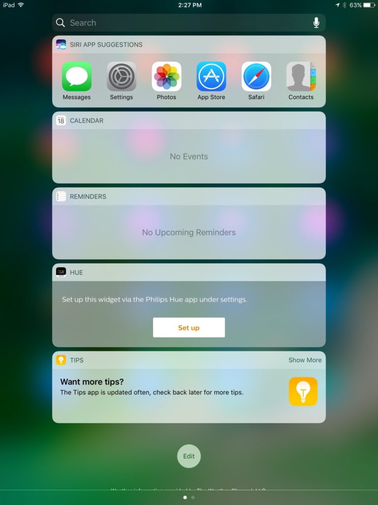
One of the features that I find is often criticized about Apple is porting iPhone elements of the UI over to the iPad, without much thought. For example, in previous versions of iOS 10, notifications were about the same size as they appeared on the iPhone. Well starting today, Apple has changed that! Now with iOS 10 beta 3, lots of the UI elements have been expanded to make full use of the iPad’s large screen. Not only does this make it fit in nicer, it also allows for more text to be read. Other elements have been changed too, such as the search bar in notification centre.
Personally, I really like that Apple is taking more time thinking about the UI on the iPad, rather then mindlessly porting it from the iPhone without any thought.
How do you like the new change? Let us know in the comments! And check out our website for more updates about iOS 10 beta 3!


