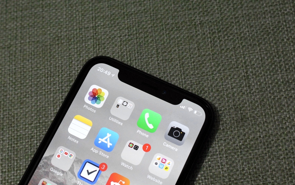
Ever since iPhone X’s release, Apple’s flagship smartphone has been under a lot of criticism due to the front camera notch on the top of its display. All the reviews that have been made on the phone emphasize on its presence, so much so that it almost becomes comical and a cliché. Its as if there’s nothing else to talk about the smartphone that is packed with amazing features.
Sure when you publish a ‘review’ of a featured packed $999+ smartphone just 2 hours after of using it, the review is going to be very superficial and the reviewer wouldn’t have the capacity to go deeper than the surface, in this case that surface has the very visible notch.
We too were not thrilled about the notch when Apple first announced the iPhone X, and still don’t really love it. However we are aware that we don’t live in the perfect world and compromises had to be made in order to add the features that users deserve going forward in 2018. In a utopia the smartphones would not have notches on the top, however we don’t live in perfect world and have to make the best out of what we have. Here are some reasons why you should not only stop complaining about the notch but actually embrace it with open arms.
It gets rid of the Carrier name
The carrier name in the status bar has been on our smartphones for so long we don’t even realize its there. This is one of those things that exists even though it serves very little to no purpose at all. No one needs to be reminded which carrier they are paying loads of money to all the time. Most of us actually remember which carrier’s SIM we are using, and in case we forget there’s always the About section for this kind of information. In addition to that the carrier name also shows up when the device is locked and in Control Center.
Due to the Notch, Apple had to remove a lot of information from the status bar, so naturally the carrier name had to go too. Now you get signal bars on the top and whether you are connected to LTE or 3G, however there’s no carrier name. And to that we say good riddance.
Hides the ugly bars for screen recording and personal hotspot
The personal hotspot bar on iOS 11 is still fat and ugly, taking up more screen real estate that it should. The Screen Recording bar is thinner and only takes up the status bar, but even this is not ideal. With iPhone X Apple has made the personal hotspot and screen recording indicators un-intrusive by putting them at the right side of the notch. This placement still makes the noticeable without causing disruption in user experience.
Great for selfies
Some smartphones such as the Xiomi Mi Mix try to get around the notch by adding the selfie camera at the bottom. Some manufacturers like Samsung make the whole area black instead of adding a notch. While Xiomi’s approach sure looks good, it also compromises the quality of the photos that you take with the front camera. The weird angle of the selfies does not look as good as the top placement. At least by adding the notch users get useful indicators like signal strength bars, time and battery on top.
You only get what’s more important
With the elimination of all the extra space, you now only get the most crucial information about your device in the status bar. Sure it was nice to have the battery percentage and VPN indicator in the status bar, however with iPhone X’s minimalistic status bar we don’t think we should be complaining too much.
It gives character to iPhone X
In the sea of smartphones with edge-to-edge displays how can anyone tell which phone do you have. Sure it doesn’t matter what Android phone you have, they all look the same to me (joke), those with the iPhone want everyone to know they align with the Apple camp. The notch makes the iPhone special by giving it a unique character. As soon as you turn on its screen any one from meters away will be able to tell it is an iPhone X. The notch is the new home button, which had made iPhone stand out in the crowd for a decade.


Oh man, that notch is sooo functional. Can’t wait to see it grow 4x the size