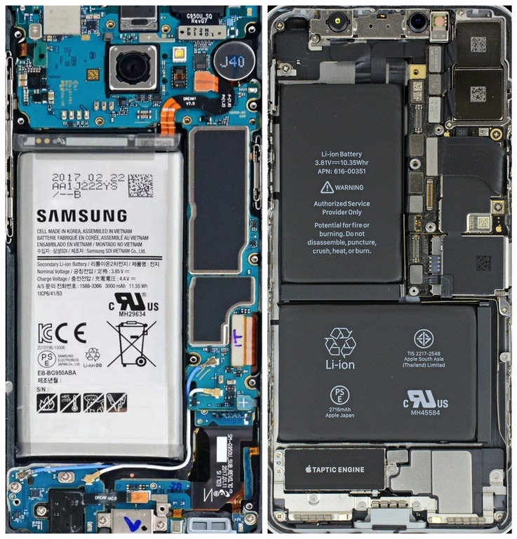
There’s a famous story about Steve Jobs and his father. According to Jobs himself, his fierce obsession for perfectionism comes from his dad’s refusal to not giving the same amount of attention to back of the cabinet that he built himself even though no one would ever see it. Later in life Jobs applied the same amount of effort to the inside of the Macintosh computer, even though no one was ever going to see it.
Its encouraging to see the same amount of importance is given to attention to detail by today’s Apple. This is evident when you compare the internals of the iPhone X with that of a Samsung smartphone. The iPhone X’s internal has an aesthetic look with different components properly marked and aligned in a beautiful manner. Samsung device’s internals on the other hand are a mess and appear hideous when compared with Apple’s. Its like zero effort was made to improve how the internal part of the device looks.
In fact iPhone X’s internals are so well designed that many people like to use the internals wallpaper as their lockscreen wallpaper, something you definitely wouldn’t want to do with the ugly Samsung internals.
While it wouldn’t matter to a normal user what the internals of their smartphone look like, it does give everyone an idea on how these companies view their devices and how much importance they give to craftsmanship.


