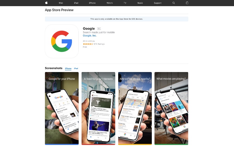
Apple has recently updated the App Store’s web interface, making it more like the iOS App Store app than ever before. Now users can view app description and screenshots on the web in a web page that resembles the App Store app’s description page a lot. The interface has been redesigned years after Apple slightly tweaked the web design and is the biggest overhaul of the online App Store pages since the beginning.
Since the older web interface had became old and outdated the new design has been designed to keep it line with the App Store’s UI. Unlike the older design, this new interface focuses more on the screenshots. On the top user can find the title, icon, developer info and ratings while right below it screenshots are displayed.
Screenshots are followed by app description and user reviews, similar to how app description pages are displayed on the iPhone and iPad. With this redesign Apple his also iPhone X screenshots for many applications complete with rounded edges and longer height.
You can see an example of redesigned App Store web interface by accessing Google’s app page here.


