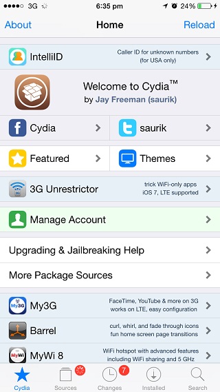
Since its first release Cydia didn’t change much, however with the release of iOS 7 update the jailbreak store received a drastic user-interface redesign that brought a flat, minimalistic interface that was inspired by the design of the operating system itself. Now Cydia has been updated again with an even cleaner and flatter interface that looks pretty nice on the larger iPhones as well as on other devices.
The new look is pretty noticeable and anyone who uses Cydia regularly would notice it right away, however it isn’t as drastic as the redesign we saw last year. Now after the roll out when you launch Cydia on your device it shows a red loading bar on top and then applies the new design. You can see the changes on Cydia’s main page, page that shows details for packages, login page and purchases page.
It is nice to see Cydia getting up to date and receiving a much needed attention as far as design and user experience is concerned. We hope Saurik and rest of the Cydia team will continue this trend and we will see more improvements and new features rolling out in the near future. We also hope that the installation page of Cydia also gets the update as that looks pretty outdated as well, doesn’t it?
Check out the new Cydia in the gallery below.


