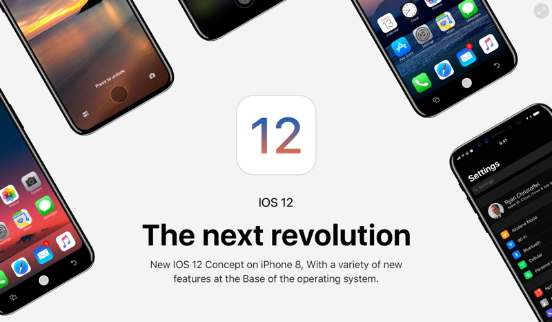
Next month we will see the release of iPhone 8 and iOS 11. However one designer is already imaging what iOS’s future looks like all the way in iOS 12, which won’t be releasing until late 2018. The developer has created concepts of iOS 12 UI running on an iPhone 8 and the result is breathtakingly beautiful.
What I like about this concept is it is quite realistic in a way that it resembles a lot to iOS 11, while fixing some of the biggest annoyances found on the operating system. This is more convincing compared to many other more radical concepts we have seen in the past that completely redesign the whole iOS interface.
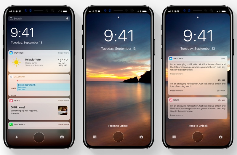
One of the biggest annoyances this concept tries to fix is the notification alerts. It groups all the notifications from the same app at one place, giving a much cleaner look. For the lockscreen the designer imagines an always on display that displays important information such as time, missed calls, messages etc with symbolic indications. Such a feature will require OLED display, which the upcoming iPhone 8’s edge-to-edge display is rumored to be.
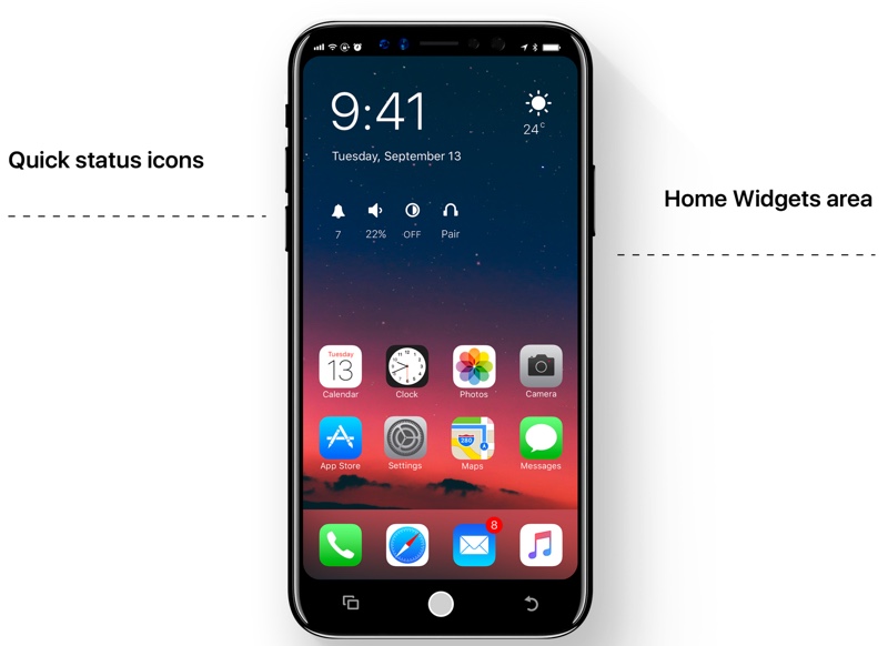
There’s also a new homescreen, which is inspired by Android’s main screen. On the homescreen you get time, weather information, status button along with 2 rows of icons. A dock is also present.
The Notification alerts have been redesigned and offer more controls to the users. A new Quick switcher, which is inspired by many jailbreak tweaks that are available for the iOS platform allow users to quickly switch to their most frequently used applications.
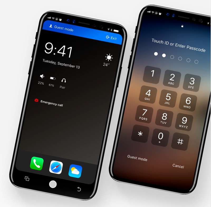
Other features that are imagined in this concept include redesigned app switcher, redesigned Camera app, a guest mode, minimalistic volume slider, universal dark mode, ability to lock any app and more. A lot of these were already on our wish list for iOS 11 but sadly Apple didn’t deliver. Here’s hoping they will next year.
Watch the iOS 12 concept running on iPhone 8 in action in the video below.


