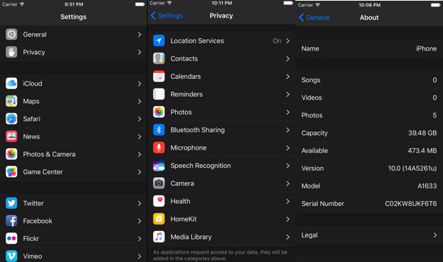
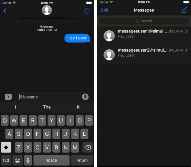
Before iOS 10 was announced at the WWDC 2016 event one of the biggest feature requests by iPhone and iPad users was the addition of dark mode to iOS devices. While Apple brought a number of user requested features to iOS in this release, it surprisingly left out the dark mode. Now as the beta is available for developers to play with they are finding several traces of dark mode hidden deep inside the iOS 10 code.
Cydia tweak developer Andrew Wiik has found a special dark interface for different stock apps including Messages and the Settings app. The developer was able to run this supposedly unfinished feature in iOS Simulator. The dark mode when enabled turns the background interface black (from white and grey) and changes the text color to white or dark grey. This behavior is seen in both Messages and Settings applications.
As Andrew notes in one of his tweets the dark mode of iOS 10 doesn’t appear to be finished and is still under development. He has shared a screenshot that shows a notification with dark background and dark text color, making it very hard to read the text.
Of course if the implementation of the dark mode was finished or if Apple had intentions of releasing it with iOS 10 beta, then the company would have announced the feature during the keynote, as it is a major feature and something users have been asking for a long time.
It is important to note that Apple has change the Clock app’s interface from dominantly white to black in iOS 10. Other apps such as iBooks also feature a dedicated ‘dark mode’. Not to mention that the iTunes app on iOS and Safari reader mode have had the dark interface for a while now.
It would be interesting to see if Apple gives a choice to users for switching between dark and light modes or it will be forced upon them with the light mode becoming thing of the past. There are reports of Apple finally bringing OLED displays to iPhone next year, which could explain company’s interest in implementing the dark mode of the operating system as those displays with their high contrast ratio are more suited for a darker interface.


