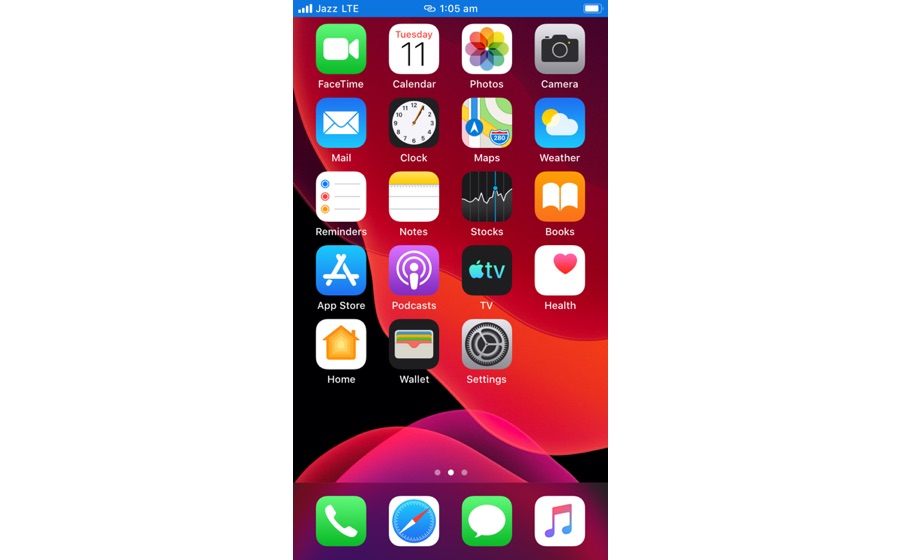
If you have a home button equipped iPhone, which includes iPhone 8, 7, or 6s then you would definitely be aware of the annoying Personal Hotspot bar that appears at the top of the screen. The blue bar shows up as soon as you connect any device to your iPhone’s cellular internet using the Personal Hotspot feature, and annoyingly stays on the screen as long as you are using the feature.
Last year we wrote about how annoying and obtrusive the blue bar is on older iPhones and Apple should make changes to make it more minimalistic. It looks like our wishes have finally been answered, as Apple has now significantly reduced the size of the personal hotspot bar and made it around 50 percent thinner. In fact the updated personal hotspot bar in iOS 13 is the same size as the status bar, so it does not block any on-screen content or becomes distracting.

With this change both Personal Hotspot and Screen Recording bars have been thinned down, as the later was updated in last year’s iOS 12 update. iOS 13 update solves many complains that users had with iOS. In addition to this iOS 13 also fixes the longstanding Volume HUD design flaw by introducing a minimalistic and modern indicator.
iOS 13 update will be released in the fall along with new 2019 iPhones.


